Create Your First Project
Start adding your projects to your portfolio. Click on "Manage Projects" to get started
LIFI Greens | Packaging Design | Case Study
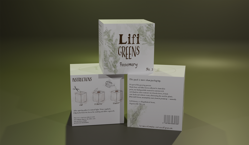
This project showcases a series of
grow your own herb product packaging, featuring detailed water-colour illustrations and instructions. The packaging includes boxes for rosemary, dill, coriander and parsley.
Project Overview
For this project, I designed a range of eco-friendly herb seed packaging for a brand called LIFI Greens. The goal was to redesign their herb packs using sustainable materials made from fallen leaves. The packaging dissolves when watered, so it needed to clearly communicate how it works and still look professional and appealing. I designed a set of eight seed packs including basil, parsley, dill, tarragon and more.
My Role
Brand designer · Packaging designer · Illustrator · 3D mock-up artist
Software Used:
Procreate · Adobe Illustrator · Blender · Calligrapher
Design Process
1. Research and Concept
I started by breaking down the brief and researching eco-friendly brands for inspiration. I wanted the packaging to feel natural, handmade and honest, so I collected references using soft, organic colours, simple layouts and hand-drawn illustration styles.
2. Logo + Typography
I explored logo ideas that mixed serif and sans serif fonts to create balance. I also designed a custom hand-drawn typeface for the herb names so each product felt unique and personal. I created this alphabet in Calligrapher and refined it in Illustrator.
3. Illustrations
I illustrated each herb and its seeds using Procreate with pencil and watercolour brushes. This gave the artwork a natural feel and matched the brand’s focus on nature and sustainability.
4. Layout + Packaging Design
I built the cube dieline in Adobe Illustrator to plan out where the content would go. I kept the layout clean and easy to read, placing the logo and herb name on the front and the planting instructions along the side. Each pack also includes a short product story and growing tips.
5. 3D Mock-ups
I used Blender to wrap my dieline around a 3D cube and created realistic renders. This helped bring the project to life and showed how it would look in the real world.
Challenges
One challenge I faced was finding the right balance between information and design. My first layout idea was too crowded, so I simplified the design to make sure the illustrations supported the text rather than competing with it.
Another challenge was learning Blender for 3D mockups, but after experimenting and following tutorials, I was able to create renders I was happy with.
Outcome
The final design looks organic, modern and consistent as a full product range. The hand-drawn font, illustrations and natural layout help give the brand personality while still feeling professional. The packaging clearly explains how to use the product and promotes the eco-friendly message.


